13 Nov The Importance of Color in the Workspace
Last year, a news story was released about the discovery of the world’s ugliest color, Pantone 448C, which was used by the Australian government on tobacco packaging to discourage smoking. This, and many other strategies are the result of the increasing amount of insight in recent years on color theory, which surrounds the meanings, effects, and use of color.
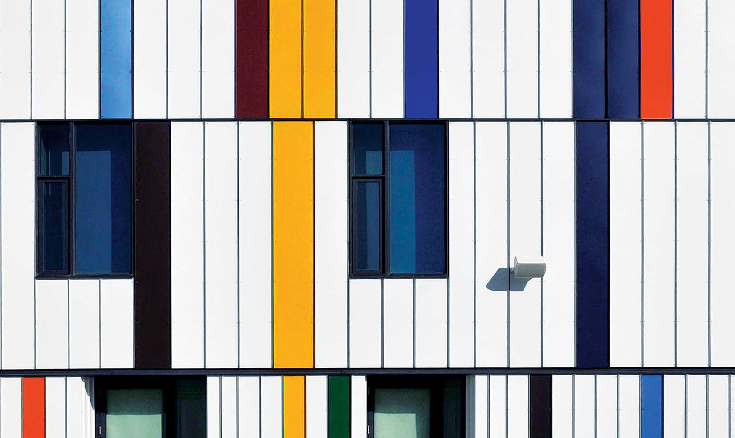
One of the primary items in the designer’s toolkit, the discussion around color is one that is always evolving. As we’ve entered this era of heightened focus on workplace design, color is now also a major consideration of psychologists and major businesses and organizations. It is a key quality of our visual perception, describing different frequencies of light through our familiar classifications such as red, yellow, or green. Our observation of different colors results from a unique combination of hue, tint, tone, and shade. It is one of the many ways we understand the world around us, and we often don’t realize how it affects many of the choices, thoughts and interactions we have on any given day. We think about color when getting dressed for work, or rely on the colored traffic lights to direct us on our commute. Our memories are filled with color, and we recognize some of the biggest brands through color.