12 Nov The Best Colors for Your Office.
After decades of research, we know that office color psychology not only affects the way your staff work and how productive they can be, but it also affects how visitors perceive and evaluate your business, so it is essential to choose the appropriate color scheme to adequately present yourself to both internal and external audiences alike.
Angela Wright, an expert on color, has been researching the impact it has on behavior since 1970. Her research challenges the thought that because people’s response to color is subjective, it must also be unpredictable. However, she explains, “When the study of color harmony is combined with the science of psychology, reactions can be predicted with startling accuracy.”
Wright recognized in studying color psychology that it is the combination of colors that triggers the response; you could have a grey sky on a summer day, but our reaction to that grey with the beautiful colors of the summer landscape would be different from the combination of a grey sky with a predominantly snow-white scene. We do not respond to just one color, but to colors in combination.
What does that mean for your office design? It means that certain colors can help to improve our productivity and well-being, whilst others work against us, severing focus and interrupting our general flow.
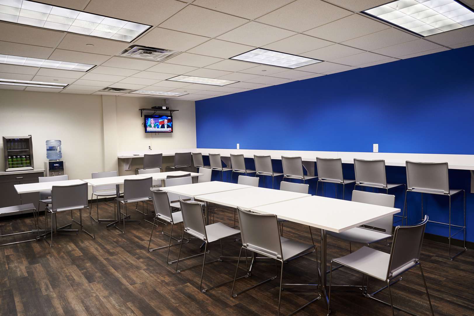
- Blue is an intellectual color. It represents trust, logic, communication, and efficiency. Often associated with depth and stability, it communicates a genuine and reliable outlook whilst boosting relaxation and intellectual thought. Blue also symbolizes trust, represents heaven, and is beneficial to the body and the mind. Use blue as the primary color in office areas that require focus and mental strain.
- Red is a physical color. It represents courage, strength, and excitement. It’s a great color to use in areas of the workplace that demand physical exertion. Red can invoke passion and raise mental energy flow; however, it can be overpowering, potentially leading to headaches. Red seems to work best for furnishings, acting as a highlight whilst giving interior spaces a nice bit of flavor and spice.
- Yellow is the emotional color. Is said to be one of the best colors for areas of teamwork, as its bright tone represents creativity, friendliness, optimism, and confidence. Yellow stimulates mental activity and generates muscle energy, but it also apparently reminds people of food, funnily enough. Incorporate yellow when you want to stimulate positivity, creativity, and happiness.
- Green provides balance. It represents harmony, nature, and restoration. Green proves to be a great color in offices that require people to work long hours since it’s the easiest color on the eyes (requiring no adjustment). It’s also a great color to use anytime a sense of balance is the top priority, which is why it’s commonly found in medical offices.
- Purple is often associated with spirituality or luxury. It can promote deep contemplation or luxury but should be used carefully, as too much (or the wrong tone) can have an opposite effect. However, purple is also deemed to be quite artificial, due to its lack of appearance in nature.
- Orange blends the physical (red) and emotional (yellow), creating a sense of comfort. It’s a color that is highly accepted amongst youths and represents happiness, success, and determination. It is often associated with food and warmth and is, therefore, a natural choice in kitchens. When used appropriately, it is also a fun color, making it an option for a casual office lounge. Orange is also highly visible color and thus attracts attention with ease; eye-catching! Use it to highlight the most important elements of your design.
- Grey often represents neutrality. We commonly see it used in offices attempting to look sleek or modern. However, when used inappropriately, it suggests a lack of confidence and can stimulate a depressing mood. As a result, be cautious when incorporating grey in certain spaces.
- Represents purity and cleanliness; a safe bet, but sometimes safe can equate to being boring and uninspiring (who wants that?) Equally, it’s important to appreciate the crispness and clarity it can bring to space. White is best used on kitchen break-out areas and wide open spaces that require a nice glossy finish. But remember, keep it to a minimum! You don’t want your interior to look too much like the dentist’s surgery now. Not the best way to attract clientele.
- Black. Black emits feelings of authority and control, but it can also absorb natural light, so be careful! It can function as a mysterious color with a sinister undertone, but on the other hand, it can create a space of luxurious elegance when used as a complementary accent.
Are you moving office, or looking for help on how to build the perfect office space? Talk to our experts today!
Sources:
https://cdispaces.ca/best-office-colors/
https://www.elledecor.com/design-decorate/color/news/a8927/best-office-colors/
https://www.sec-online.co.uk/article/psychology-what-colour-scheme-does-your-office-need