
28 Apr Colors that Improve Workplace Results
Office Design: Why Color is So Important
Are you left feeling uninspired by the sight of endless white walls, gray carpets and bland furnishings of certain workspaces? You’re not alone.
According to an often-cited University of Texas study from the 2010s, too much gray, beige or white in an office correlates with feelings of sadness and depression in employees.
Conversely, bringing color into a workspace can have the opposite effect. Indeed, when used intelligently, color has the power to not only reflect your company’s brand and ethos, and look great – it also has the power to enhance the wellbeing and productivity of your employees, and deliver greater business outcomes.
Great spaces inspire great work. And in today’s hybrid work landscape, where offices have to work even harder to attract employees back through their doors, there are even less excuses for employing a bland color scheme. And one of the most powerful yet simple ways to create an impactful, inspiring office space is with excellent use of color.
Let’s take a deeper look…
Great spaces inspire great work. And in today’s hybrid work landscape, where offices have to work even harder to attract employees back through their doors, there are even less excuses for employing a bland color scheme. And one of the most powerful yet simple ways to create an impactful, inspiring office space is with excellent use of color. Let’s take a deeper look
Bringing Color into your Workplace Design. Where to Start?
As with natural light and temperature, color is regarded as another environmental factor – with the power to impact human perception and behavior. Therefore, understanding the ways in which color can affect your employees is an essential first step in creating an efficient and engaging work environment.
There are whole rainbows of shades and hues and tones out there, however – so where do you even start when it comes to choosing the right palette for your brand, your people and business goals?
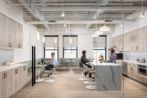
RI’s Director of Design, Komel Saeed, says, ‘When I start designing a space I always think about what makes a space inviting – the answer for me has always been warmth. Warmth is achieved in color, temperature of the lighting, color tones for overall finish palettes and various textures.
“The use of color in a space has a psychological effect on your nervous system. For example colors such as green or blue have a calming effect whereas, if a person is surrounded by vibrant color tones such as reds or oranges they will feel more energetic or passionate. I design modern interiors largely with a neutral base palette and add on colors based on the function of the space.”
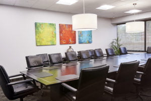
Take a look at the image above to see how we incorporated pale greens, blues and stones into the scheme we recently completed for a New York City law firm.
How do office colors affect employees?

We do lots of research into color at RI, and one paper from 2018 – a study of multiple global studies on color in the workplace – offered the following takeaways, all of which echo our own thoughts:
- Cool colors (blues and greens) are calming.
- Shades of green are easy on the eye and are associated with relaxation and happiness – they also evoke the most positive emotional responses in employees.
- An overload of blue can have a drowsy effect.
- The right amount of blue can enhance creative task performance.
- Warm colors (oranges and reds) are stimulating.
- Working in an overly red or colorful room can put the brain into a more excited state – causing overstimulation and a lack of concentration.
- Accents and splashes of red in the workspace area can enhance cognitive task performance.
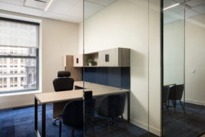
- Earthy colors – and the balance of warm and cool tones – can enhance productivity. Take a look at the private office space we created for our law firm client KDLM, below, for an example.
- Cool colors enhance creativity and support the generation of ideas – theorists believe this is because cool colors are calming whereas warm colors are overstimulating making it difficult for people to concentrate.
The right approach to designing with color
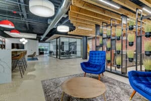
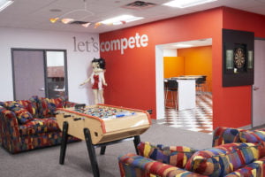
At RI, we love color. And we have loved bringing bright vibrant colors into our own workspace, in splashes and pops of color – as you can see in the image above.
When working with clients on a new design brief, one of the first things we discuss is their brand color palette and associated tones. Using a company’s brand colors is essential in connecting people, staff and clients to a business and its values. But it’s not a simple case of splashing that particular paint color all over the walls.
We also always consider the brand color in relation to other interior design elements, such as an office’s lighting, furniture and textures. The aim is to strike the right balance between creating an aesthetically pleasing space with one that is both comfortable and productive.
Which office areas benefit from vibrant colors?
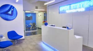
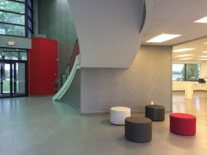
Your reception space is a key area for communicating your brand through color. Your foyer is the space that makes the first – and final, lasting – impression on all those who pass through. Take a look at the bold foyer we created for our client, Open Systems Technologies, above. Also, at the use of red in the foyer for another of our clients, Jura, below – where a pop of color, in both cases, creates a memorable space.
Today’s successful hybrid office space delivers a wide choice of flexibility over where and how to work – and color is a really effective way of defining and zoning these spaces.
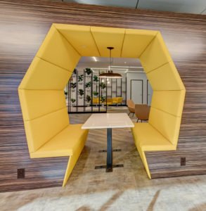
Collaborative hubs, for instance, can benefit from the use of bright, vibrant colors to imbue a space with a sense of energy and creativity. We created hive-like seating areas for our client, Coulmed, in a rich yellow, below – a color associated with creativity.
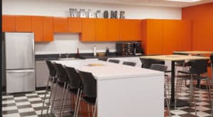
Breakout areas and social spaces are another great area in which to play with brighter, warmer colors. Take a look at the work we did for a New York design agency, below.
Areas dedicated to quieter, concentrated work, meanwhile, benefit from the use of softer, muted tones – where the design focus can be more on texture than color. A good example of this is the open-plan desk area space we worked on for KDLM, below.
You don’t need to think of color merely in terms of wall color, either. A neutral base can be home to colorful furniture, art, flooring and ceilings.
Conclusion
Employers are having to find ever-more inspiring reasons to get their staff back into the office in the hybrid work landscape – and color has a vital role to play in delivering an inviting space. Indeed, with the increasing popularity of the ‘resi-mercial’ aesthetic – the blurring between commercial and residential design – companies who want to retain and acquire the best staff, and get the best results, should have, at the top of their priority list alongside wellbeing and growth opportunities, inspiring office design.
Why use RI?
Increasing companies’ profitability by delivering workspaces in which employees thrive and profits grow is our MO. While working with you to create your space, we take into account the multiple personality types that make up your organization and tailor our design approach, including our use of color, accordingly. Our goal is to strive for balance every time and in doing so, create motivating, inspiring, relaxing and soothing spaces that positively impact workplace-outcomes.


